Goal: Promoting Social Connection Through Music
In this design project, my team and I researched and designed a mobile music application
that helps users see and interact with music and each other in a more direct, engaging
way. We built upon social web theories and findings from our think alouds and literature
review to influence our designs.
As the Lead UX Researcher, I set the research goals for the project, designed research
guides, conducted the majority of tests, and led synthesis. In addition, I served as the
primary interaction designer, creating interactive prototypes and animations in Figma.
Influences and Competitive Analysis
With the relatively open-ended assignment of designing an interesting social app, my team was inspired to tackle the area of music listening by our perceived dearth of social interaction in existing streaming platforms. While mainstream music platforms, like Spotify, YouTube Music, and Soundcloud feature varying levels of social interaction, we wanted to design an app that was “social web first.” Our most significant influence was Netease Cloud Music, a Chinese music streaming service that facilitates user discussion about music.
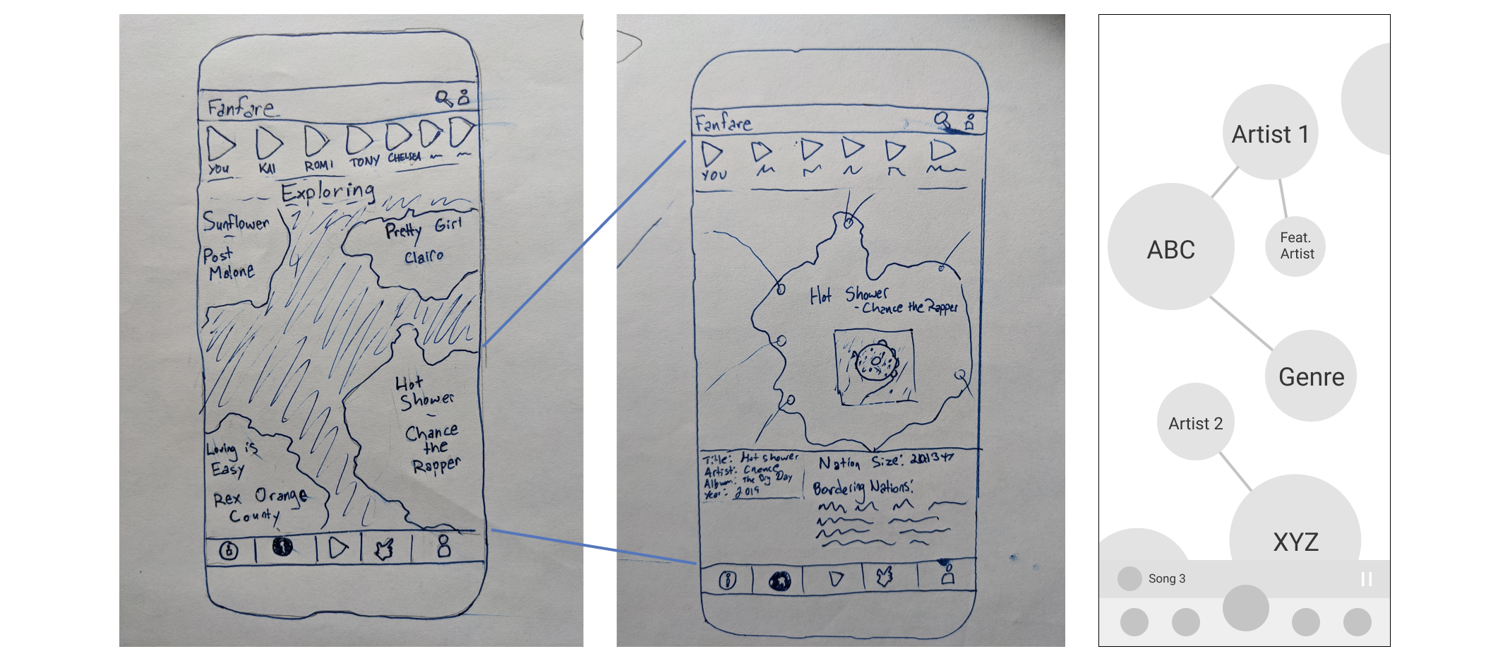
Low-fidelity prototypes: Aligning on a direction and preliminary feedback
Each member of the team designed low fidelity screens to represent ideas for our app’s
possible directions. Our ideas were aligned in that they all incorporated novel ways to
visualize social and musical relationships. We decided to move forward with a visual style
emulating node network diagrams, and we identified 4 screens that we felt were necessary
for the final product.
My team and I then worked together to create digital low-fidelity screens, striving for
multiple possible versions of each screen. I created an interactive version of select
screens, and we presented our interactive prototype and other screens to our professors and
classmates. In doing so, we sought feedback on their preferred designs and their general
input on app-based social interaction regarding music. We took inspiration from this
feedback, noting potential features to include or exclude in our next set of designs.
At this point, I drafted an interview guide for user testing and ran a pilot study with 1
participant. Not only did this participant provide useful feedback that echoed some of our
classmates’, but this preliminary test helped me better organize my questions and
format for future tests.
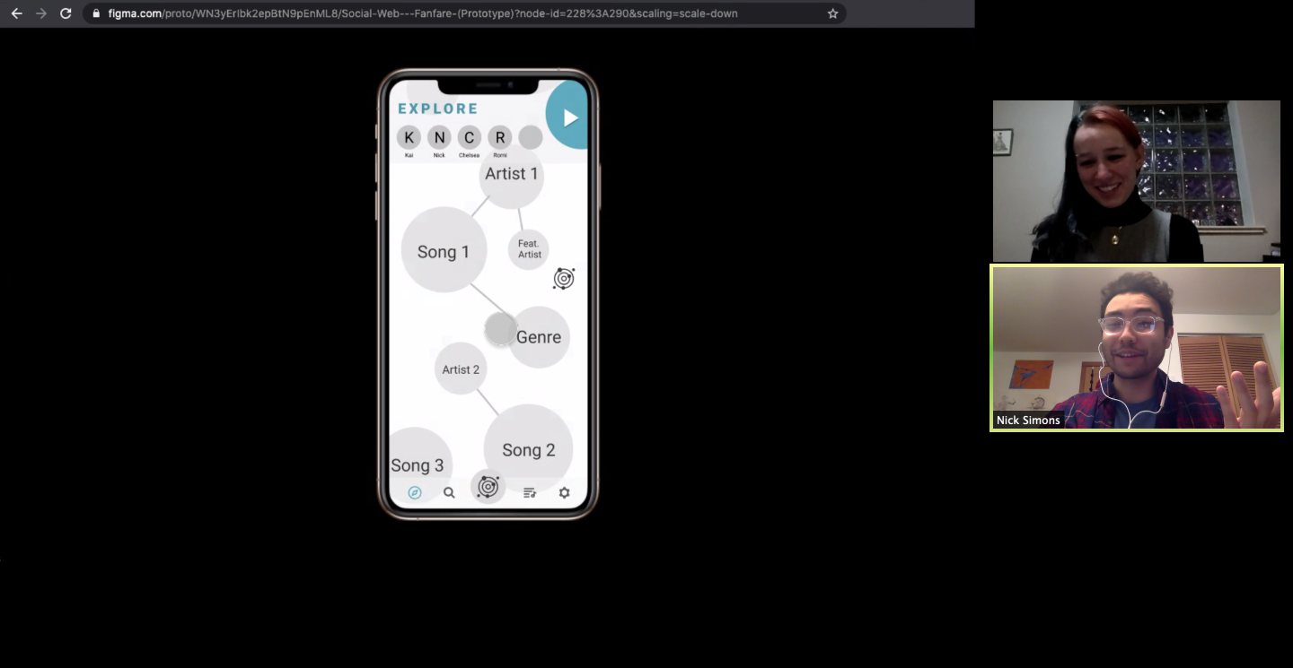
Leading Think Alouds with Mid-fi Prototypes: Narrowing our Focus
Using that feedback, my team and I created mid-fidelity prototypes. I then led the team
in conducting think aloud tests with millennial music fans, who we identified as our target
users. These think alouds were conducted using Zoom and Figma.
My first step was to link our mid-fidelity screens and make them interactive, so that users
could click through all screens during think aloud tests. Next, I created a user flow for
the think aloud sessions and wrote a series of questions that I felt we needed to answer in
each session. Of course, these tests were largely meant to uncover potential usability
issues at an early stage, since this was a design project. However, I also wanted to ask
users questions about the ways that they engage with one another regarding music, hoping to
identify angles that our app could uniquely address.
In this first round of think alouds, we tested with a total of 8 participants. Through
Google Docs and Zoom, I then led the team in synthesis. Besides feedback on aesthetics, we
found that navigation in our app was unintuitive, largely because of our attempts at unique
features. More interestingly, we found that every participant has shared music with friends
or family, but sharing methods are inconsistent both within and across users -- there’s no
universal way to share music.
Leading Think Alouds with High-fi Prototypes: Usability Testing
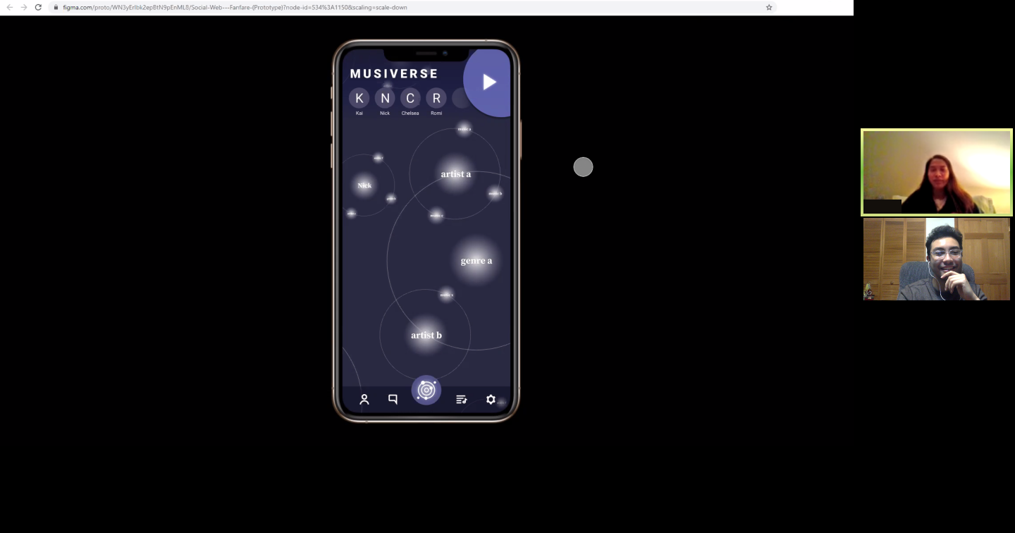
After revising our designs based on results from mid-fidelity think alouds, my team and
I created high-fidelity designs in Figma, this time incorporating a visual design inspired
by solar systems, as we felt that this design would better capture hierarchy than the node
network design. I animated those designs to make them seamlessly interactive, both for
presentation purposes and to enable user testing.
With interactive designs ready, I once again created user testing guides and recruited
millennial music listeners. I then conducted all of the think aloud sessions with these
prototypes, with 8 users. This time, I focused more heavily on usability than the previous
round, hoping to determine how well we had addressed issues raised in our mid-fidelity
prototypes as well as identify new usability issues.
Results
From the final round of think aloud tests, I uncovered a few areas of improvement for
the designs that could be implemented were my team and I to move forward with the app.
First, in an effort to design interesting visuals and interactions, it was apparent that
the team created some rather unintuitive features -- however, every user was able to learn
interactions after a short period of testing or minor hints, and remember those
interactions for the remainder of the test. Another interesting finding was that 4
participants, unprompted, expressed that their musical tastes do not “fit” well into
predefined genre categories. These insights promise an opportunity for interesting research
in the future.
The team’s final deliverables included a presentation on our research and designs, a
project report, and our high-fidelity, interactive screen designs in Figma.
Reflection
This project afforded me the greatest opportunity to lead research as I saw fit. I was able to set a fair research plan and assign different research tasks to individual teammates, and everyone adhered to that plan and those tasks. Because this was primarily a design project, I was forced to squeeze research into a small window, meaning that I wasn’t able to be as thorough as I would have liked. Even so, I am happy to say that my teammates were more than willing to base design decisions on our research!